")
")
 Cartogram
Cartogram
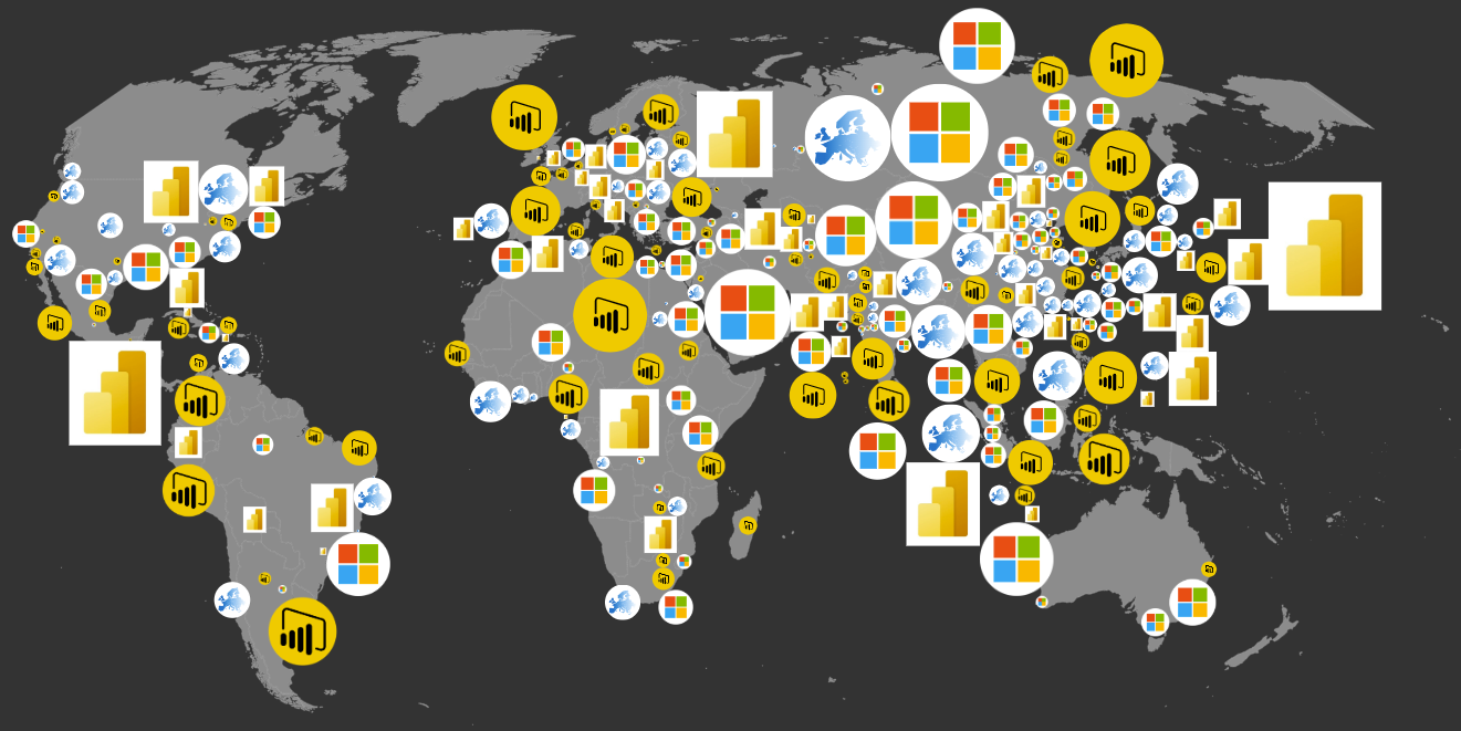
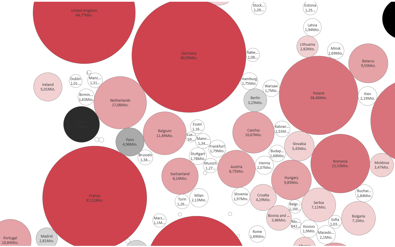
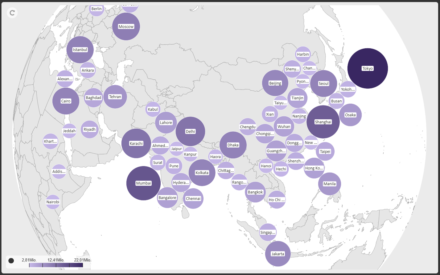
Cartogram is a new custom visual for Power BI that transforms geographic or categorical data into clean, geometric representations—perfect for scenarios where spatial relationships matter less than clarity, comparability, and visual impact. Building on the foundation of the very popular Maps visual, Cartogram lets you abstract locations, regions, or custom shapes into consistent geometric forms such as circles, squares, rectangles, diamonds, triangles, or even circular and rectangular images.
Instead of relying on traditional map layouts, Cartogram focuses on shape‑based storytelling: each data point becomes a scalable, positionable geometric object whose size, color, label, and formatting can be driven directly by your dataset. This makes it ideal for density‑equalizing cartograms, KPI dashboards, grid‑based layouts, or any visualization where uniform shapes communicate more effectively than geographic outlines.
Cartogram supports rich formatting options, conditional styling, and interactive features such as selection, highlighting, and tooltips—ensuring your visuals remain both expressive and analytically powerful. Whether you're comparing markets, visualizing clusters, or presenting abstracted spatial data, Cartogram offers a flexible, modern way to turn complex information into intuitive visual patterns.