")
")
Table of Contents
 Maps Documentation
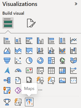
Maps is a custom visual for Power BI designed to meet your geographic data visualization needs with modern, multi‑layer mapping capabilities. It builds on familiar concepts while introducing advanced features that help you analyze spatial data with clarity and precision.
Maps provides access to over 200 built‑in global and regional maps, covering a wide range of geographic areas. It supports intuitive interactions such as zooming, panning, selecting, and drilling, and offers multiple geographic projections to adapt the map to your analytical context. Because all map material is included directly in the visual, Maps works fully offline — without an Internet connection and without relying on external map services like OpenStreetMap, Google Maps, or Bing Maps.
This documentation will guide you through the features and usage of the Maps visual, helping you effectively integrate it into your Power BI reports.
Why another map visual?
To better understand the role of Maps within Power BI’s mapping ecosystem, the following comparison highlights how it differs from the built‑in Shape Map, Azure Maps, and Filled Map visuals. Each visual serves a distinct purpose, and this matrix summarizes their functional capabilities across key mapping features. It provides a neutral, technical overview to help you determine which visual best fits your geographic analysis needs.
Comparison: Maps vs. Shape Map vs. Azure Maps vs. Filled Map
| Feature | Maps | Shape Map  | Azure Maps  | Filled Map  |
|---|---|---|---|---|
| Multi-layer mapping (areas, points, routes) | ✔ | ✖ | ✖ | ✖ |
| Routes / connections | ✔ | ✖ | ✔ | ✖ |
| Point markers | ✔ | ✖ | ✔ | ✖ |
| Custom shapes | ✔ | ✔ | ✖ | ✖ |
| Choropleth coloring | ✔ | ✔ | ✔ (columns only) | ✔ |
| Built-in map material | ✔ | ✔ | ✖ | ✔ |
| Offline usage (no external map service) | ✔ | ✔ | ✖ | ✖ |
| Mini-charts on the map | ✔ | ✖ | ✖ | ✖ |
| Measure-driven icons / images | ✔ | ✖ | ✖ | ✖ |
| Animated flows (Moving Dash) | ✔ | ✖ | ✖ | ✖ |
| Multi‑Line / Multi‑Measure Labels | ✔ | ✖ | ✖ | ✖ |
| Category-specific formatting | ✔ | ✖ | ✖ | ✖ |
| Shape shadows | ✔ | ✖ | ✖ | ✖ |
| Multiple geographic projections | ✔ | ✖ | ✖ | ✖ |
| Point of View (localized territorial representation) | ✔ | ✔ (limited) | ✖ | ✔ (only standard geographies) |
| Auto-centering / auto-zoom | ✔ | ✖ | ✔ (filters only) | ✔ (basic) |
| Interactivity (zoom, pan, rotate) | ✔ | ✔ | ✔ | ✔ (limited) |
| Custom drill-down hierarchies | ✔ | ✔ (limited) | ✖ | ✖ |
| Tile-service related features (see limitations) | ✖ | ✖ | ✔ | ✔ (Bing Maps) |
| Multi-language support | ✔ | ✖ | ✔ (limited) | ✔ (labels only) |
Limitations
Maps is designed as an offline, fully self‑contained mapping visual. This architectural choice differentiates it from Azure Maps and other tile‑based mapping services, and it introduces several intentional limitations:
- No background map tiles Maps does not load external map services such as Bing Maps, Azure Maps, OpenStreetMap, or Google Maps. Satellite imagery, street maps, and tile‑based layers are not supported.
- No heatmaps Density‑based heatmap visualizations are not available.
- No point clustering Automatic aggregation of point markers at high densities is not supported.
- No geocoding Maps does not convert addresses into coordinates. All geographic coordinates must be provided through the Power BI data model.
- No 3D map views Features such as 3D buildings, tilt/pitch, or perspective map views are not supported.
- No API‑based data enrichment Routing, isochrone, search, or weather APIs (as available in Azure Maps) are not supported. Maps visualizes only the data directly contained in the Power BI model.
These limitations are part of the core design philosophy of Maps: a powerful, flexible, and fully offline geo‑visualization solution that operates without external dependencies, providing maximum stability, control, and data privacy.
Video Tutorials
Tutorial: Shape Mapping
Tutorial: Custom Regions
Tutorial: Projections
Tutorial: Points & Connections
Tutorial: Labels
Tutorial: Colors
Tutorial: User Interaction
Tutorial: Charts
Tutorial: Dynamic Map Switching
Maps Promo
How to get it
You can obtain Maps conveniently by using the "Get more visuals" function in Power BI Desktop or the Power BI Service.
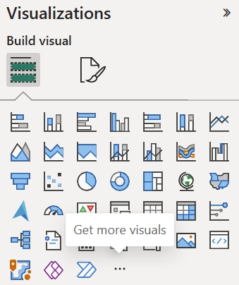
A dialog box will appear, displaying a gallery of popular visuals and a search field. Use the search function and type "Maps" or "relevantvisuals" to find our visual. The resulting page will provide general information, details on plans and pricing, as well as ratings and reviews. Clicking the blue "Add" button will include the visual in your current Power BI report, enabling you to use it.
Data
Data Fields
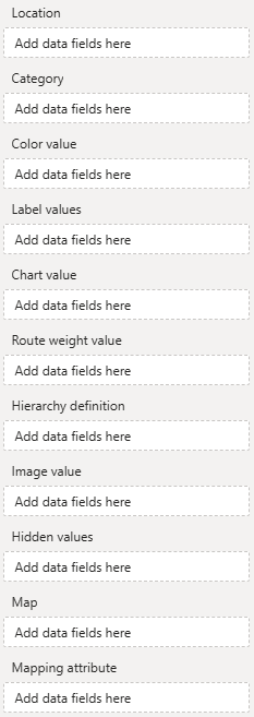
Location - Used to reference geographic element (shape, point or route). To reference shapes use aivalable mapping attributes (e.g., a country's ISO code), for points and routes use geo-coordinates.
Category - Use this categorical field as identifier to set (formatting group based) colors and formatting.
Color value - Use to conditionally color shapes, points and routes.
Label values - One or multiple measures to be show as shape, point or route labels on the map.
Chart value - Assign a measure to this field to enable value‑based sizing of mini‑charts.
Route weight value - Assign a measure to this field for value‑based line weights.
Hierarchy definition - Custom shape hierarchies can be defined here.
Image value - Assign images to be displayed on the map (as markers or charts) here.
Hidden values - Assign additional measures (used for sorting or in tooltips) here.
Map - Assign a string measure to dynamically override the “Map” selection in the formatting pane.
Mapping attribute - Assign a string measure to dynamically set the mapping attribute used for shape mapping.
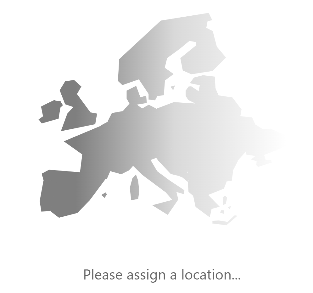
Assign at least a location field. An orthographic projection of the Earth will appear, and the formatting area will be populated with the visual's formatting options.
Field: Location
The location field is essential, because it is used to reference areas, points, or lines on the map. Areas are referenced using mapping attributes, while points and lines are defined by their geographic coordinates.
Mapping areas using mapping attributes
Areas are referenced using so-called mapping attributes. Each area of a map has a set of mapping attributes you can use. For example, on the default world map the United States of America can be referenced using either one of these attributes:
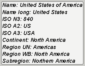
Use a data field containing country names, ISO codes (numerical three-digit or alphabetical two- or three-digit) to reference a single country, continent names, names of regions (United Nations grouping or World Bank grouping), or names of sub-regions to reference a group of countries. By assigning multiple data fields each referencing a different mapping attribute on a different drill level (e.g., continent and country), you can create a hierarchy, users can use to drill down. You can even define your own hierarchies.
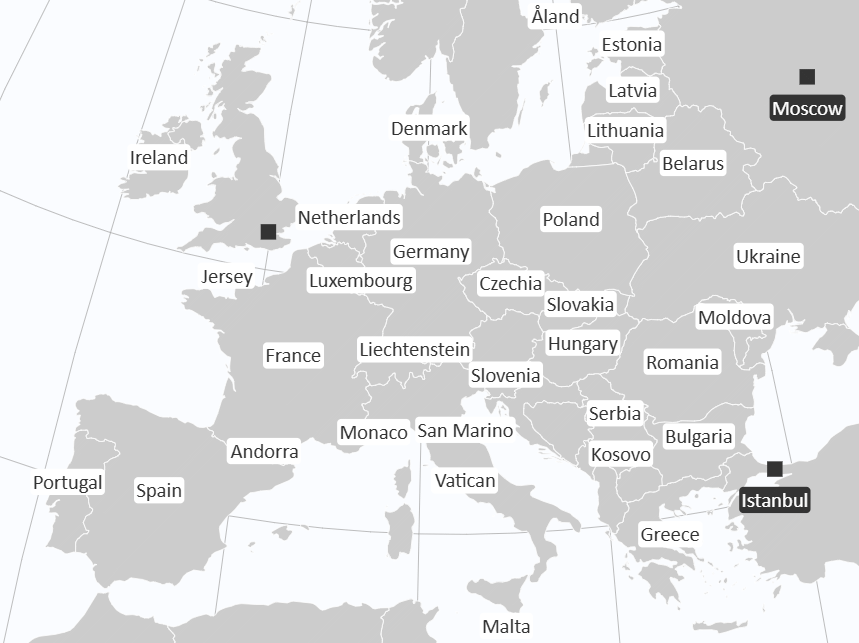
To get an overview of available mapping attributes, assign any data to the "Location" field and toggle "Show mapping info" in the map formatting options.
This will display the mapping information for all areas of the map that could not be mapped using the provided "Location" data.
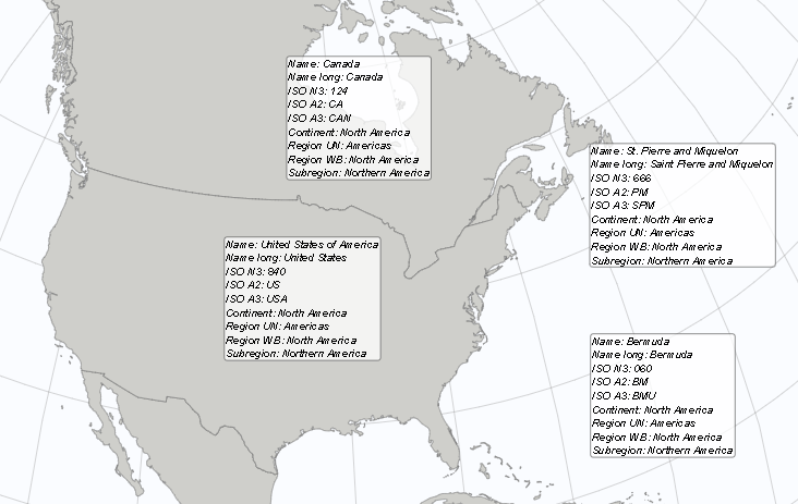
To avoid ambiguous shape resolution, specify the Mapping attribute field. It explicitly selects the mapping attribute the visual should use when multiple identifiers are available.
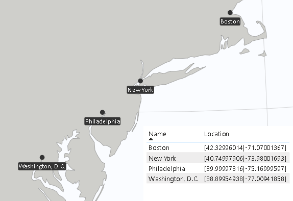
Projecting points by their geo coordinates
To project points on a map (e.g., cities or your company's locations), provide the point's geographic coordinates in the form [latitude|longitude]. For example, to display Berlin, Germany, on the map, use the measure value [52.52|13.40], and for New York City, use [40.75|-73.98].
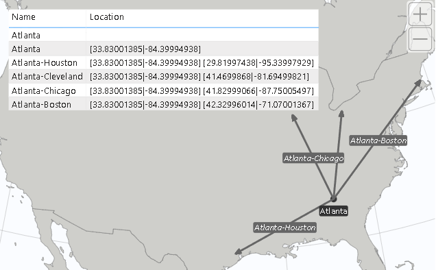
Projecting lines/routes using their defining geo points
Similar to how points are projected on a map, you can also draw lines by defining their start and end points in the form of [latitude|longitude] [latitude|longitude]. For example, to draw a line from Berlin to New York City, you would use the measure value "[52.52|13.40] [40.75|-73.98]". Note that line definitions are not limited to just two coordinates, allowing you to visualize multiple connected lines (e.g., multi-stop routes).
Field: Category
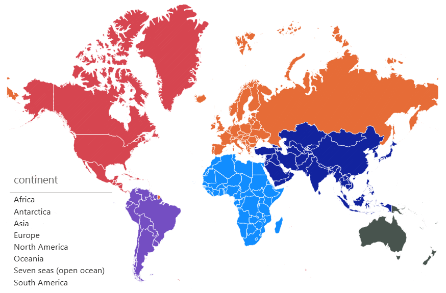
The category field can be used to categorize locations and assign them a specific (group) color or other formatting (e.g., label or point marker formatting). For example, you could assign a color to your company's customer locations to represent their customer status. Group colors can be applied to areas, points and lines. Group individual formattings are available for labels and point markers.
Here is an example. The countries are colored by category "continent":
Categories can also be used as legends or to group values in mini‑charts.
For example, you can turn a single‑bubble chart into a packed‑bubble chart by separating the bubbles by category:
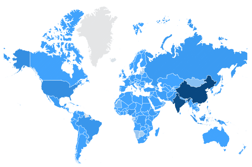
Field: Color value
With the "Color value" measure, you can implement value-based coloration for specific map elements, i.e. areas/shapes and routes/lines. Once a color value is assigned, users can enable coloration by color value and define colors and color scales in the visual's formatting area.
Here is an example. The countries are colored by their population:
Field: Label values
To display labels on areas/shapes, points, or lines, use the Label values data field. Labels can be numeric (e.g., sales for that location) or textual (e.g., the name of the location). To show multiple labels, simply assign multiple measures. They will be displayed line by line in the order in which they are assigned.
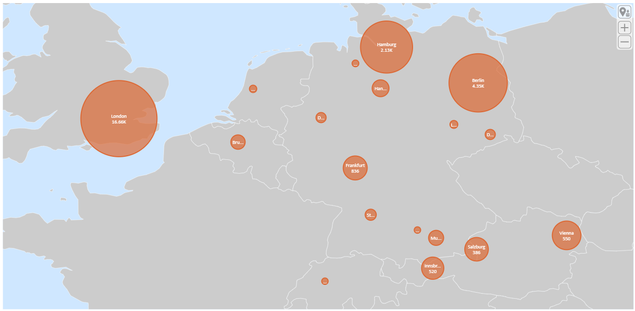
Field: Chart value
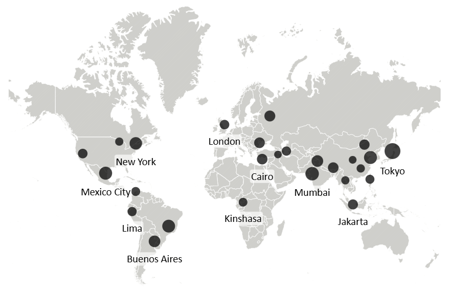
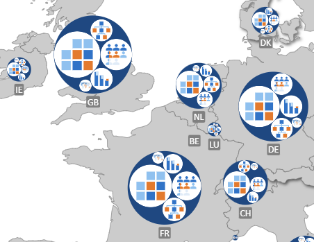
For minicharts (columns or circles) on areas, points or connections/flows/routes use the Chart value measure.
Here is an example where the circle sizes represent the populations of the cities:
Field: Route weight value
Assign a measure to this field to control conditional line weight. When a measure is placed here, the visual can use its value to dynamically scale the stroke width of routes (e.g., flows, connections). Otherwise, the default line width from the formatting pane is used (see Routes).
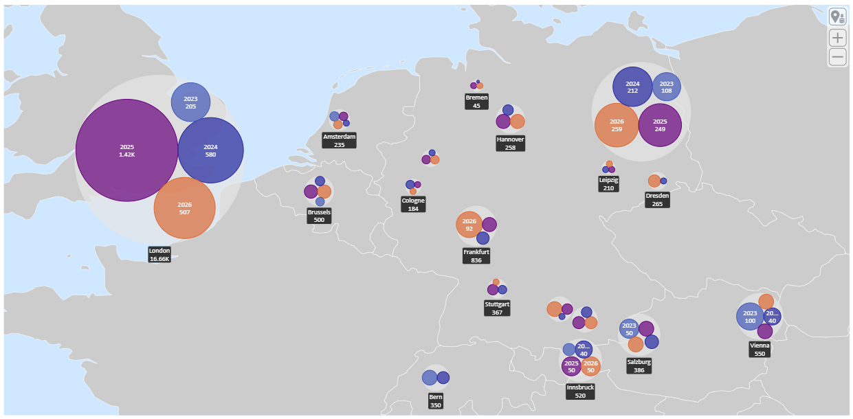
Field: Hierarchy definition
As explained in the Location section, users can drill down along predefined hierarchies if multiple fields are assigned, each containing matching mapping attribute references (e.g., continent "North America" on level 1 and country "US" on level 2).
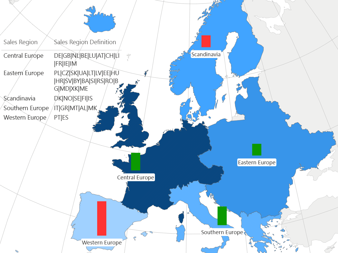
With the "Hierarchy definition" measure, you can define additional groups to create your own two-level drill hierarchy. To create a group, the "Hierarchy definition" measure must contain, for each "Location" value, a list of areas/shapes (with matching mapping attributes) that the group consists of, separated by "|". For example, to define a custom group NAFTA, the measure value for that group would be US|CA|MX.
Here is an example of a hierarchy definition.
Before drill:
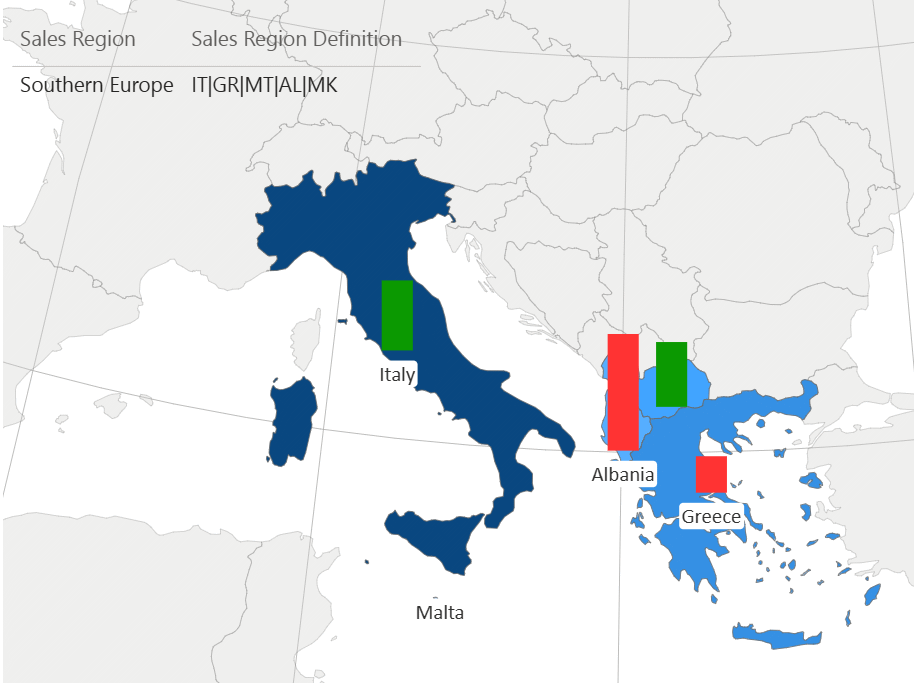
After drill on Southern Europe:
Field: Image value
Assign images to be displayed on the map (as markers or charts) here. The visual expects Data URI values, preferably Base64‑encoded. URL‑encoded SVG or other URL‑encoded strings are not supported and may be rejected by the sanitizer.
Field: Hidden values
Use this field for additional measures you need for sorting or measures to show exclusively in tooltips.
Field: Map
Assign a string measure to dynamically override the Map selection in the formatting pane. Use either the full map name or its abbreviation exactly as it appears in the map drop‑down. This allows you to switch maps based on your data
Field: Mapping attribute
The Mapping attribute field defines which mapping attribute (see Location) is used for shape resolution. Since many shapes expose several identifying attributes (e.g., name, admin, iso_a2, region), selecting the mapping attribute ensures that the visual uses the correct one when multiple matches are possible.
Formatting
Map & projection settings
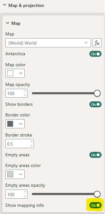
Map
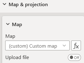
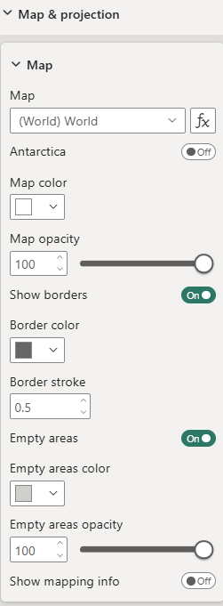 Map - Choose from over 150 built‑in maps (e.g., world, continents, individual countries with their administrative areas) to visualize your data. In addition, you can select Custom map to upload and use your own GeoJSON or TopoJSON map. This allows you to work with fully custom shapes, regions, or boundaries that are not included in the built‑in map library.
Map formatting - Define map color, opacity, and borders.
Empty areas - Toggle to display areas/shapes without data mapped to them.
Mapping info for unmapped areas - Toggle to show available mapping attributes to support data preparation and mapping.
Custom map
To upload your own GeoJSON or TopoJSON map and use it as your shape map or as a background for your routes and points, choose Custom map in the map selection.
An upload option will appear, allowing you to select the map file you want to use:
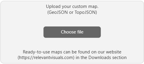
If you need to replace the file later, you can make the upload button reappear by toggling Upload file.
The visual supports only a single TopoJSON layer. If the uploaded file contains multiple layers (objects), only the first one will be used and all additional layers will be ignored.
In addition, the visual supports only Polygon and MultiPolygon geometries. Other geometry types (such as LineString, MultiLineString, or Point) are ignored during shape rendering.
Projection settings
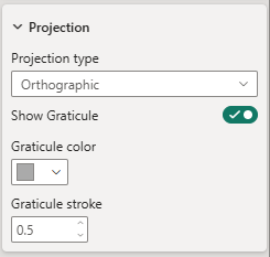
Projection type - Choose from the projections available for the selected map. The options vary depending on the map selection.
Graticule settings - Only when using the orthographic projection, you have the option to display a graticule. If you opt to show it, define its color and stroke width (in pixels) here.
Interaction settings
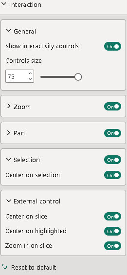 General
Show interactivity controls - Toggle to display buttons directly on the visualization that allow convenient control of interaction settings. The buttons are located on the left side of the visual. For documentation on each button, see Interactivity controls. This is a premium feature.
Controls size - Define the size of these buttons.
Zoom
Toggle to enable zoom functionality on the visualization.
Show zoom controls - Toggle to display zoom buttons on the right side of the visual, allowing zoom via button clicks. If disabled, zooming is available using your device’s default method (e.g., mouse wheel, two-finger gesture).
Controls size - Define the size of the zoom control buttons.
Show zoom level - Toggle to display the current zoom level on the visualization.
Pan
Toggle to enable visual panning via drag.
Selection
Toggle to enable selection functionality within the visualization. Hold Ctrl (or your system’s equivalent meta key) to select multiple elements.
Center on selection - Toggle to have the visualization automatically center on the last selected element.
Center on slice - Toggle to have the visualization automatically center on filtered elements. This is a premium feature.
Center on highlighted - Toggle to have the visualization automatically center on highlighted elements. This is a premium feature.
Zoom on slice - Toggle to have the visualization automatically zoom in on filtered elements. This is a premium feature.
Interactivity controls
 |
Restore saved position |
 |
Enable/disable zoom |
 |
Enable/disable pan |
 |
Enable/disable selection |
 |
Enable/disable center on selection |
 |
Enable/disable center on slice |
 |
Enable/disable center on highlights |
 |
Enable/disable zoom in on slice/filtered elements |
 |
Enable/disable zoom in on highlighted elements |
Point marker settings
The point marker settings become available as soon as your location data contains geo‑points, defined by their latitude and longitude (see point mapping).
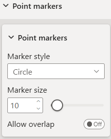
Point markers - If your data (locations) includes point coordinates, you can define the marker format here, i.e., marker style (circle, square, diamond, pin, or star) and marker size (in pixels).
Allow overlap - Toggle to make the visual always show all markers, even when they overlap.
Route settings
The routes settings become available as soon as your location data contains connections/flows or routes (e.g., multi-stop connections), defined by pairs of latitude and longitude (see route mapping).
Appearance
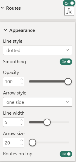 Line style - Options are solid, dashed, dotted, dashed (moving), and dotted (moving). Moving styles animate the dashes or dots along the line to visually indicate flow direction.
Smoothing - Toggle to smooth the lines.
Opacity - Make lines transparent by decreasing their opacity.
Arrow style - Lines can optionally have an arrow at the start, the end, or on both sides.
Line width (pixels) - Default stroke width of the lines.
Arrow size - Size of the arrows (in pixels).
Routes on top - Toggle to place routes/connections/flows on top of charts. Otherwise, charts will be placed on top.
Conditional width
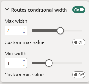 Max/min width and custom max/min - Controls how width of flows/connections/routes is scaled. If max and min values are provided, these override the automatically calculated range.
Category settings
The Category field can be used in two different ways: for location grouping, or as an additional dimension in mini‑charts (e.g., the axis in a column chart). This behavior is entirely data‑driven. If the relationship location → category is unique, the category effectively groups locations. If it is not unique, the category values can be used as a second dimension inside mini‑charts.
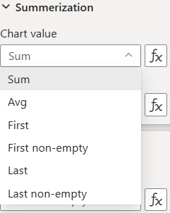
Summarization
Summarization applies only to measures. If the relationship location → category is not unique, the visual must aggregate measure values across categories for elements that apply to the location itself (such as label or color values). The summarization settings let you define how each measure should be aggregated across categories for that location.
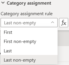
Category assignment
When a location has multiple category values, the visual must determine which category to assign to the location itself — for example when showing the category in tooltips or when coloring locations by category. The category assignment setting defines how the visual selects a single category value for each location.
Label settings
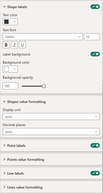
Labels can be displayed on all map elements (areas/shapes, points, and lines). They can be formatted individually for each element type.
Shape labels - Define formatting for labels on areas/shapes: color, font, background, and background opacity.
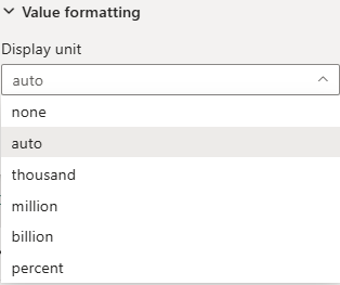
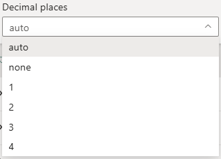
Shapes value formatting - Value formatting (display unit and decimal places) to be applied when the measure "Label value" is numeric.
Point labels - Define formatting for labels on point elements. Formatting options are equivalent to those of shape labels.
Line labels - Define formatting for labels on line/route elements. Formatting options are equivalent to those of shape labels.
Chart settings
Minicharts can be displayed on areas/shapes, points, as well as routes/flows/connections on the map.
Charts can be turned on or off and formatted individually for each element type. The formatting options are the same.
You can choose from different chart types: column, line, bubble, pie/donut and varios charts that simply scale icons or custom images according to the chart value measure.
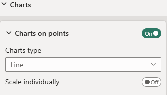
Depending on the selected chart type there are various specific formatting options. See Chart types.
All charts share the settings for opacity and overlap control.
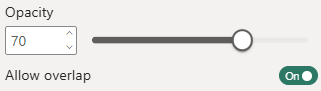 Opacity - Reduce to make charts transparent.
Allow overlap - Overlapping charts will remain visible if toggled. Otherwise overlapping charts will be removed in defined data order.
Some charts come with an anchor option for the chart positioning with two choices:
- Center of chart - the chart itself is centered on the geographic location
- Center of chart and label - the center of chart and label (above or below) is centered on the geographic location
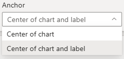
Chart types
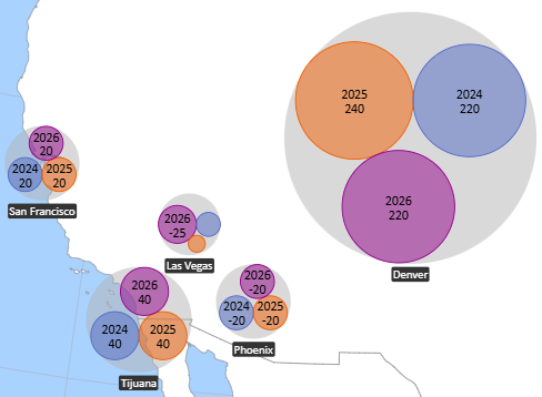
Bubble chart
A Bubble Chart displays one or multiple circular bubbles. Each bubble’s radius represents the value of the assigned Chart/size value measure. When categories are enabled, the chart generates one bubble per category instead of a single aggregated bubble.
Bubble chart settings
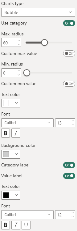 Use category - Enables the category field to create multiple packed bubbles.
Bubble radius and custom max/min - Controls how bubble sizes are calculated and scaled. If max and min values are provided, these override the automatically calculated size range.
Label text formatting - Defines how the main bubble label is displayed.
Background color - Sets the fill color of the background circle.
Category and value labels - Controls whether category names and/or value labels are displayed inside the bubble.
Category and value label text formatting - Provides formatting options for the category and value labels, including font family, font size and text color.
Bubble chart example
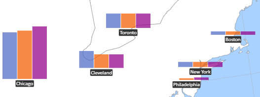
Column chart
A Column Chart displays one or multiple vertical columns for each chart element. The height of each column represents the absolute value of the assigned Chart value measure. When categories are enabled, the chart displays one column per category, aligned along the x‑axis.
Column chart settings
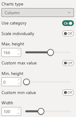 Use category - Enables the category field as the x‑axis.
Scale individually - Controls how column heights are scaled.
Enabled: scaling is performed per location, across that location’s categories only
Disabled: scaling is performed globally across all locations, allowing direct comparison between locations
This setting determines whether the chart emphasizes local variation or global comparability.
Column height and custom min/max - Defines the maximum visual height of the columns and allows optional custom scaling ranges.
If custom min and max value are provided, these values override the automatically calculated data range. This is useful when you want consistent scaling across multiple report pages or when emphasizing specific value ranges.
Width - Specifies the total width of the mini‑chart. For Column Charts, this affects the column width, spacing, and overall chart footprint.
Column chart example
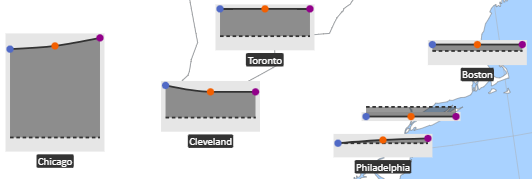
Line chart
A Line Chart displays a single line across categories. Each point on the line represents the value of the assigned Chart value measure. If no category is provided, the chart cannot form a line — it will display only a single point, and only if point markers are enabled.
When a category field is assigned, the categories form the x‑axis, and the line connects the values in category order.
Line chart settings
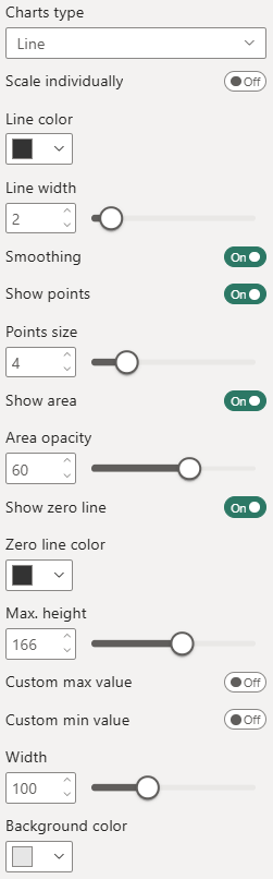 Scale individually - Controls how column heights are scaled.
Enabled: scaling is performed per location, across that location’s categories only
Disabled: scaling is performed globally across all locations, allowing direct comparison between locations
Line color and width - Defines the appearance of the line.
Smoothing - Applies optional curve smoothing.
Show points and points size - Controls the visibility of individual data points.
Show area and area opacity - Adds an optional filled area beneath the line.
Show zero line and zero line color - Displays a horizontal reference line at value 0. Useful for deviation‑based or financial data.
Chart height and custom max/min - Defines the vertical size of the chart and allows custom scaling. You can specify custom minimum value and custom maximum value. These override the automatically calculated range.
Width - Specifies the total width of the mini‑chart.
Background color - Sets the background fill of the chart area.
Line chart example
(with area, points and zero line)
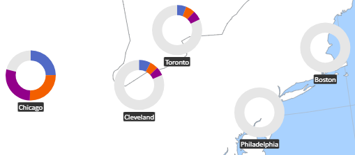
Pie/donut chart
A Pie Chart displays values as circular segments, with each segment representing the absolute value of the assigned Chart value measure. A Donut Chart works the same way but includes an inner radius, creating a hollow center.
When categories are enabled, the chart displays one segment per category, forming a multi‑segment pie or donut. Category segments become visually meaningful once they are colored by category (see the Colors section).
Pie/donut chart settings
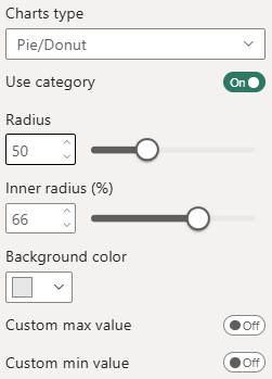 Use category - Enables the category field to create separate segments.
Radius - Defines the overall size of the pie or donut.
Inner radius (%) - Sets the inner radius as a percentage of the outer radius. This setting determines whether the chart appears as a pie or donut.
Background color - Defines the background fill behind the segments. Useful for contrast or when placing charts on colored map layers.
Custom max./min. value - Allows overriding the automatically calculated value range.
Donut chart example
Circle chart
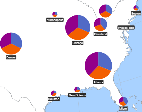
A Circle Chart displays a single circle whose radius is scaled based on the assigned Chart value measure. Unlike the Pie/Donut Chart, the Circle Chart does not use fixed radius values — the size of the circle directly reflects the data value.
When categories are enabled, the Circle Chart automatically becomes a Pie Chart, with one segment per category. In this mode, the radius still scales with the total value, while the category field defines the segment distribution.
Circle chart settings
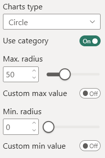 Use category - Controls whether the chart displays a single scaled circle or a category‑based pie.
Max./min. radius and custom max./min. value - Defines how the circle radius is scaled.
Circle chart example
Pin chart & Star chart
The Pin Chart and Star Chart display a single symbol (a pin or a star) whose size is scaled based on the assigned Chart value measure. Both chart types function as simple magnitude indicators and differ only in their visual shape.
Pin chart settings
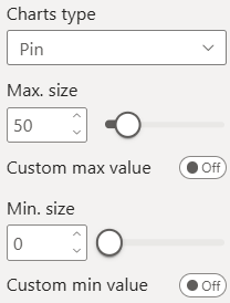 Max./min. size and custom max./min. value - Defines how the pin or star is scaled.
Pin chart and star chart examples
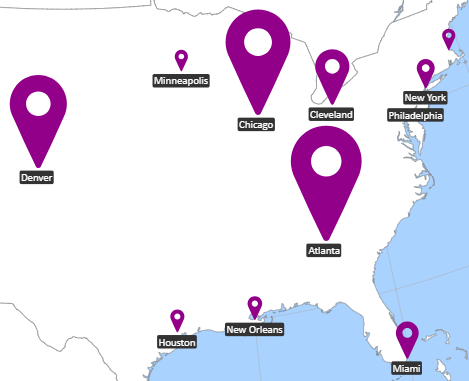
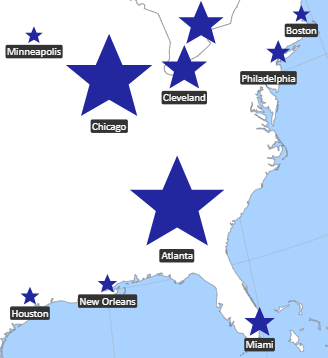
Image chart
An Image Chart displays one or multiple images whose size is scaled based on the assigned Chart value measure. Without a category, the chart shows a single scaled image. When categories are enabled, the chart displays one image per category, arranged using a packed layout. The packing can be either circular or rectangular, depending on the selected image shape.
This makes the Image Chart a visual alternative to the Bubble Chart, using images instead of circles while following the same scaling logic.
Image chart settings
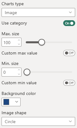 Use category - Controls whether the chart displays a single image or multiple packed images.
Chart size and custom min/max - Defines how image size is scaled.
Background color - Sets the background fill behind the image or packed images. Useful for contrast or when placing images on colored map layers.
Image shape - Determines both the visual shape of each image and the packing algorithm used when categories are enabled.
Image chart example
Color settings
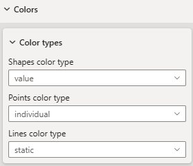
Color types
There are four "Color types" that define the basis of coloration. They can be individually selected for each element type (area/shape, point and route).
Depending on the color type selection the according formatting options will appear.
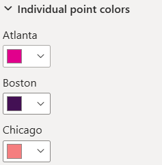
Individual color
Individual color for each single location of a type, e.g. points.
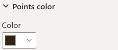
Static color
Same static color for all elements of an element type.
Color by category
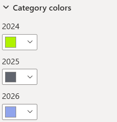
Individual color for each category. Elements will inherit color from their category (see Category).
Color by value
If you have assigned a measure to color value, you can use value based coloration.
You can choose from four scale types: linear, logarithmic, diverging and threshold.
Linear scale
A linear scale assigns colors proportionally across the numeric range of your measure. It is the most intuitive option when values are evenly distributed.
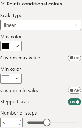 You can define:
- Min color — applied to the lowest value
- Max color — applied to the highest value
-
All intermediate values are interpolated linearly between these two colors.
By default, the scale uses the actual minimum and maximum of your data. You can override these boundaries by setting:
- Custom min value
- Custom max value
This is useful when:
- you want consistent coloring across multiple pages or filters
- you want to ignore outliers
- you want to enforce a fixed color range
Stepped scale
If you enable Stepped scale, the continuous gradient is replaced with discrete color bands.
You can define how many discrete color intervals the scale should use (number of steps).
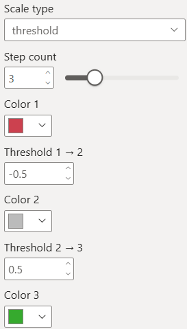
Threshold scale
A threshold scale assigns colors based on fixed value boundaries, where each range/step between two thresholds is mapped to a specific color.
You can define from 2 to 6 steps with their exact color value accordingly 1 to 5 threshold values.
Legends
A legend explains how colors, symbols, or ranges in the visual map to underlying data values, helping users understand what each color or category represents.
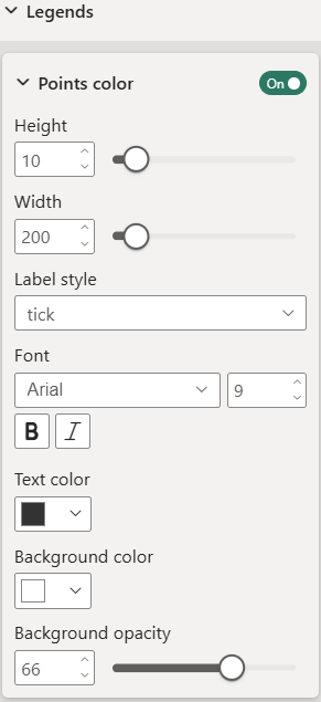 Height and width - Defines the overall size of the legend, where width controls the total horizontal space and height refers specifically to the scale bar without the label.
Text properties - Controls how the legend labels are displayed, including font, size, style, and color.
Label style - Determines whether the legend shows labels on the ticks or displays range labels instead.
Background color and opacity - Formats the background box of the legend, including fill color and transparency.
Tooltips
These settings control what is displayed in the standard tooltip. They do not affect Report Page tooltips, which are fully controlled by the report page itself.
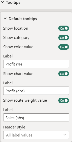 Show location - Displays the location value in the tooltip body.
Show category - Shows the category value associated with the data point, if a category field is assigned.
Show measures (color value, chart value, ...) and labels - Controls which measure values (e.g., color value, chart value, route value) and their corresponding labels are included in the tooltip.
Header style - Defines what label values are included in the tooltip header.
You can choose between:
- All label values — displays all available label fields in the tooltip header.
- 1st label value — displays only the first label field as the header.
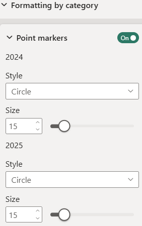
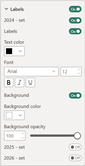
Formatting by category
Formatting by category allows you to apply individual visual styles to each category, but requires that a category field is assigned to the visual. Once a category field is present, you can customize marker appearance and label styling separately for every category.
Point markers
For each category, you can define an individual marker style (Circle, Square, Diamond, Pin, or Star) and set a custom marker size.
Labels
For each category, you can configure individual text properties, including text color, font, and background color.
Value formatting
Value formatting can be set for all available measure fields (color, label, chart, etc.). It will be considered when a measure has a numeric value and is shown on the screen, e.g. as label or tooltip.
You can define a display unit and decimal places.